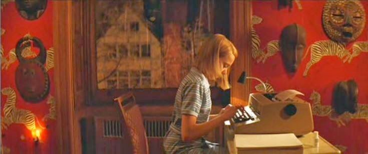
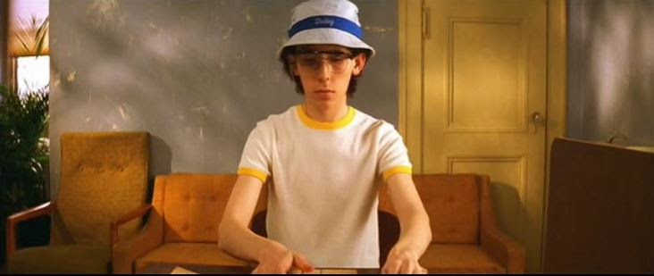
With his last movie , The Grand Budapest Hotel , Wes Anderson not only confirms that he’s a brilliant director but also reveals that he could have been a great interior designer! Colors , furniture , lights , disposition , all reveals that décor is important for esthetic reasons but also has a meaning of its own.
Explosive colors
Red and Purple
Mixing bright red and purple is a bold choice , yet it is the main color theme of the Grand Budapest hotel. From the elevator walls to the lobby rugs through staff uniforms , red and purple are the sign that you belong to this special hotel. The two main characters are indeed proudly wearing these colors , even outside of the hotel.
Not really well-known for being the best match , these two colors have first been associated by Yves Saint-Laurent , inspired by the mix and match of colors in Morocco. Maybe India (let’s remember Darjeeling Limited) was Wes Anderson’s inspiration for this masterful association of colors.
 |
| (with a touch of orange , like Yves Saint-Laurent in his time) |
Orange and Green
Orange and green are two colors which echo themselves quite brutally as well. He uses these two colors , which were very fashionable during the Sixties , to show that time has changed. But the dull tones used (also in contrast with the bright red and purple of the 30’s) let show that the hotel is not what it used to be anymore.
Light pink , blue and green
These colors are often associated with a female world; linked to the young baker in the Grand Budapest Hotel , similar colors are present in the bathroom of Tenenbaums’ daughter in the Royal Tenenbaums.
Complementary colors
Wes Anderson uses a lot of other bright colors , and plays with strong and explosive combinations. He often associates so-called ‘complementary colors’ , well-known among artists and physicists for their capacity to enhance one another.
Yellow and Blue
Yellow and Purple
Pink and Green
The way Wes Anderson uses colors is not only visually strong but it also gives a fresh look to interiors that are either too classical or a bit old-fashioned.
Lights
Like all good interior designer , Wes Anderson knows how to use light and lights to create a specific atmosphere.
A perfect symetry
Wes Anderson’s shots are often perfectly symmetrical , as this video demonstrates.
Symmetry reinforce the beauty of a scene while giving an impression of order and completeness.
Characters and Decors
Last but not least , if colors and decors are that thoroughly chosen by the director , it’s because they do not only serve an esthetic goal , they also reflect the characters who live in them and thus serve to introduce these characters and to understand them better. In the Royal Tenenbaums , characters are introduced through their bedrooms. In the Grand Budapest Hotel , the main character keeps wearing the old colors of the hotel even though the décor has changed , to signify that he , hasn’t changed.
 |
| (zebra wallpaper available at Salamandre) |
Lessons to be learned? Don’t be afraid to DARE vivid colors and to furnish your home as YOU wish , remember , your home reveals a bit of who you are! J
link to the video of the making-of of the Hotel Décor.


